What Size Painting for a Vancouver Condo? | Artist’s Size Guide

What Size Original Painting Works in a Vancouver Condo?

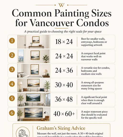
Infographic showing common painting sizes for Vancouver condos, from 18 × 24 to 40 × 60+ inches, with room examples and original art sizing advice from Vancouver artist Graham Watts.

An Artist’s Guide to Choosing the Right Scale for Your Space

One of the most common concerns I hear from collectors is that their condo may be too small for a larger original painting.

In my experience, the opposite problem is often more common: the artwork is too small for the wall.

A 30 × 40-inch original painting can work surprisingly well in a Vancouver condo when it has enough clear wall around it and can be viewed from an appropriate distance. Rather than recommending artwork based only on the square footage of a home, I look at the actual wall, the furniture beneath it, the ceiling height, the surrounding architecture and where the painting will normally be viewed from.

When a collector is unsure, I usually ask for a straight-on photograph of the wall and its measurements. I can then create a digital room mock-up showing the artwork at different sizes before they make a decision.

That often makes the right scale immediately obvious.

If you are already considering a painting, you can view my available original paintings or contact me directly and send me a photograph of your wall.


Is a 30 × 40 Painting Too Large for a Condo?

Usually, no.

A 30 × 40-inch painting is large enough to create a strong focal point without requiring an enormous room. It is a size I use frequently because it gives me enough canvas to create depth, texture and visual impact while still fitting comfortably on many residential walls.

Whether a 30 × 40 painting works has much less to do with the total size of the condo than people sometimes assume.

I am usually more interested in questions such as:

  • How wide is the usable section of wall?
  • Is there furniture below the painting?
  • How high is the ceiling?
  • Are there windows, shelves or architectural features nearby?
  • How far away will you normally stand or sit when viewing the painting?
  • Is the painting horizontal, square or vertical?
  • Will it be framed?

A relatively compact Vancouver condo can easily have a wall where a 30 × 40-inch original looks completely natural.

You can see examples of the different sizes and formats I work with in my collection of original paintings.


Measure the Wall, Not Just the Room

When someone tells me, “My condo is only 700 square feet,” that does not actually tell me very much about the appropriate painting size.

Two condos with exactly the same square footage can have completely different wall configurations.

One might have a large uninterrupted living-room wall. Another may have windows, patio doors, shelving and architectural columns dividing the available space.

For that reason, I prefer to measure the usable wall area rather than make assumptions based on the size of the home.

A smaller home does not automatically require smaller artwork.

In some cases, one substantial painting can actually make a compact room feel calmer and more intentional than several smaller pieces competing for attention.


What Size Painting Should Go Above a Sofa?

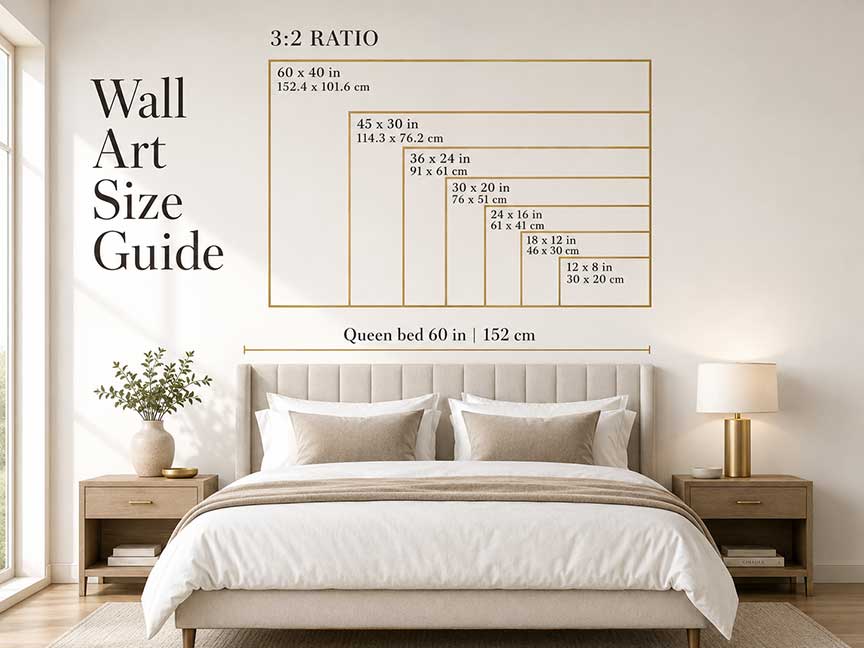
A useful starting point is to choose artwork that measures approximately two-thirds to three-quarters of the width of the furniture beneath it.

For example, if a sofa is 72 inches wide, artwork somewhere around 48 to 54 inches wide can be a reasonable starting point.

I treat that as a guideline rather than a strict rule.

The right size also depends on:

  • the width and height of the wall
  • ceiling height
  • surrounding furniture
  • the orientation of the painting
  • whether the artwork is framed
  • the strength of the colours and composition

A highly detailed or strongly coloured painting can sometimes feel visually larger than its actual dimensions.

A quieter painting may need more physical scale to create the same presence.

The goal is not to satisfy a mathematical formula. It is to make the painting feel intentional within the room.


How I Help Collectors Choose the Right Painting Size

When someone is considering one of my original paintings or thinking about a custom art commission, I often use a simple process.

1. Send Me a Straight-On Photograph of the Wall

The photograph should ideally be taken directly in front of the wall rather than from an angle.

This makes it easier for me to estimate proportions accurately.

2. Measure the Usable Wall

I usually want the approximate width and height of the area where the artwork might hang.

There may be a much larger wall physically, but windows, light switches, shelving, doors or furniture can reduce the area that actually matters.

3. Measure the Furniture Beneath It

If there is a sofa, bed, console or cabinet below the painting, knowing its width helps establish proportion.

4. Think About Where You Will Normally See the Painting

A painting is rarely experienced from one position.

You might normally see it:

  • while sitting on the opposite sofa
  • from the kitchen
  • when entering the condo
  • from the dining table
  • while walking through the room

5. Compare Different Painting Sizes

I can digitally place a painting into your photograph and compare several possible dimensions.

For example:

  • 24 × 30 inches
  • 30 × 40 inches
  • 36 × 48 inches

Seeing those options in the actual room is usually far more useful than trying to imagine the difference from measurements alone.

This is also part of the process I use when creating a commissioned original oil painting.


Viewing Distance Matters More Than Many People Realize

A painting is rarely experienced from only a few inches away.

In an open-plan Vancouver condo, an artwork may be viewed from eight, ten or even fifteen feet across the living and dining space.

That viewing distance can make a larger painting feel surprisingly natural.

A 30 × 40-inch painting viewed from across a room may not feel particularly large at all. Instead, it can act as a clear visual anchor.

This is one reason I am cautious about automatically recommending small paintings for small homes.

Sometimes increasing the size creates a simpler and more cohesive room.


How I Think About Common Painting Sizes

There is no universal rule, but these are the general ways I think about several common canvas sizes when helping collectors.

Painting SizeHow I Generally Think About It
18 × 24 inchesUseful for smaller walls, bedrooms, entryways or secondary artwork
24 × 24 inchesCompact focal point that can work particularly well on narrower walls
24 × 36 inchesA versatile size for condos, bedrooms and medium-size walls
30 × 40 inchesA strong all-purpose statement size for many living spaces
36 × 48 inchesA significant focal point when there is enough clear wall around it
40 × 60 inches and largerA major statement piece that should usually be evaluated for the particular wall

These are not universal decorating rules.

They are simply how I think about the canvas sizes I regularly work with as a Canadian oil painter.

You can compare some of these formats by browsing my available original artwork.


One Large Painting or Several Smaller Pieces?

Both approaches can work beautifully.

But if a collector wants one artwork to become the main focal point of a room, I usually recommend exploring a substantial single painting before automatically filling the wall with several small pieces.

Every frame, edge and gap in a group of artworks introduces another visual element.

One large original can give the eye a place to rest.

This can be particularly effective in a condo where the living room, dining room and kitchen are visually connected.

Several smaller paintings can work extremely well too, especially when they have a strong relationship to one another.

The important thing is that the choice feels intentional.


You Do Not Always Need the Larger or More Expensive Option

One of the benefits of creating a room mock-up is that it can reveal when the smaller painting is actually the better choice.

If that is what I see, I will say so.

The goal is not to put the largest or most expensive painting on the wall.

You do not need the more expensive option if the smaller painting is the better fit.

Sometimes a 24 × 30-inch painting is exactly what the room needs.

Sometimes the same wall clearly benefits from a 30 × 40.

Being able to compare them before purchasing removes much of the guesswork.

If you would like an opinion on a particular painting, contact me and send a photograph of your wall.


Horizontal, Square or Vertical?

The orientation of a painting can matter almost as much as its dimensions.

Horizontal Paintings

Horizontal paintings often work naturally above:

  • sofas
  • beds
  • consoles
  • long dining-room walls

Many mountain landscapes, Vancouver cityscapes and ski paintings naturally lend themselves to this format.

Square Paintings

Square artwork can be particularly useful in condos because it creates significant presence without requiring an extremely wide wall.

A 30 × 30 or 36 × 36-inch painting can make a very strong focal point.

I also use square canvases regularly for wildlife paintings because the proportions can create a powerful relationship between the animal and the viewer.

Vertical Paintings

Vertical paintings can work beautifully on:

  • narrower wall sections
  • entryways
  • walls between windows
  • stair landings
  • walls beside consoles or architectural features

Sometimes the shape of the wall provides the answer before the subject of the painting does.


Does a Frame Change the Size Decision?

Yes.

A frame adds to the overall visual footprint of a painting.

A 30 × 40-inch gallery-wrapped canvas will occupy less wall space than the same painting inside a substantial frame.

Floating frames generally add less visual weight than heavy traditional frames, but they still change the overall dimensions.

When I create a room visualization, I prefer to represent the finished presentation whenever possible rather than considering only the raw canvas dimensions.

That gives the collector a better sense of what the artwork will actually look like once it is installed.


How High Should an Original Painting Hang?

A useful starting point is to position artwork so that its visual centre sits somewhere around normal eye level.

When a painting is above a sofa, console or other piece of furniture, I also want it to feel visually connected to the furniture rather than floating unusually high above it.

I generally pay more attention to how the artwork relates to the room than following any single measurement rigidly.

A painting should feel like it belongs to the space around it.


What About a Vancouver Condo With a Great View?

This is a particularly interesting question in Vancouver.

Many homes already have dramatic views of the North Shore mountains, ocean, city skyline or surrounding landscape.

I do not necessarily think artwork needs to compete with that view.

Sometimes a painting works best on an adjacent wall, where it becomes part of the visual rhythm of the room rather than trying to overpower the window.

A British Columbia landscape or wildlife painting can also create an interesting relationship with the environment outside.

My own work is strongly influenced by Vancouver, Whistler and the Sea-to-Sky landscape, so I am particularly interested in that relationship between the artwork, the home and the landscape beyond it.

You can explore more of these subjects throughout my original painting collection.


Natural Light Matters Too

Large windows are one of the great features of many Vancouver condos, but they can affect how artwork is experienced.

Strong daylight changes throughout the day and can influence:

  • colour
  • glare
  • shadows
  • contrast
  • how strongly a painting appears against the wall

Oil paintings also have physical surface texture, and changing light can reveal that texture differently throughout the day.

When possible, I like to understand where the windows are in relation to the proposed artwork.


A Real Room Is Better Than a Generic Size Chart

Size charts can be useful starting points.

But the most reliable way to decide whether a particular painting works in a particular home is to look at the actual space.

That is why I encourage collectors to send me a photograph.

Once I can see the room, I can usually make a much more useful recommendation than I could from measurements alone.

The conversation often becomes very simple:

“This one feels too small.”

“This one overwhelms the wall.”

“This size feels right.”

That is much more useful than trying to force every room into the same mathematical formula.


Can Large Art Work in a Small Room?

Absolutely.

Large artwork does not automatically make a room feel smaller.

In fact, one substantial painting can sometimes make a compact room feel calmer because it creates one clear focal point rather than numerous smaller visual elements.

The key is allowing the painting enough visual breathing room.

If every wall is already visually busy, adding another large object may feel overwhelming.

But when a painting is given a clear wall and allowed to become the focal point, larger scale can be extremely effective.


Should the Painting Match the Furniture?

I do not think artwork needs to match a sofa, rug or cushions perfectly.

A painting should have enough relationship with the room that it feels comfortable there, but that does not mean repeating exactly the same colours.

Original artwork can introduce contrast, personality and energy.

I would rather see a collector choose a painting they genuinely connect with than select something simply because its colours match the furniture.

Furniture may eventually change.

A meaningful original painting may stay with you for decades.


My Advice Before Buying a Large Original Painting

If you love a painting but are uncertain about its size, do not rely entirely on imagination.

Measure the wall.

Take a photograph.

Compare the artwork visually at scale.

If necessary, use painter’s tape to outline the proposed dimensions directly on the wall.

A 30 × 40-inch rectangle becomes much easier to understand when you can actually see those dimensions in the room.

And if you are considering one of my paintings, you are welcome to contact me directly and send me a photograph of the wall.

I would much rather help you choose the right size before you purchase than have you wonder afterward whether another size would have worked better.


Frequently Asked Questions About Choosing Painting Size

Is a 30 × 40 painting too large for a condo?

In many cases, no. A 30 × 40-inch painting can work very well in a condo when the wall has enough clear space around it. Wall dimensions, furniture placement and viewing distance are usually more important than the overall square footage of the home.

What size painting should I hang above a sofa?

A useful starting point is artwork approximately two-thirds to three-quarters of the sofa’s width. I treat this as a guideline rather than a strict rule because the wall, ceiling height, framing and visual strength of the painting also affect the result.

Can a large painting work in a small room?

Yes. One large painting can sometimes make a compact room feel more cohesive because it creates a single focal point rather than many smaller visual elements.

How can I see what a painting will look like on my wall before buying it?

Send me a straight-on photograph of your wall along with its approximate measurements. I can create a digital room mock-up showing the artwork at scale so that you can compare different sizes before making a decision. Contact me here.

Does a frame count when choosing painting size?

Yes. A frame increases both the physical dimensions and visual weight of the artwork, so I recommend considering the finished framed size rather than only the dimensions of the canvas.

Is one large painting better than several small paintings?

Neither option is universally better. If you want one strong focal point, a larger original painting can create a clean, cohesive look. Multiple smaller works can be effective when they are intentionally grouped and relate well to one another.

Can Graham help me determine the size of a commissioned painting?

Yes. Choosing the appropriate canvas size is part of my custom commission process. We can discuss the wall, room, dimensions and subject and use a digital mock-up to help determine what scale works best.


Not Sure What Size Painting Will Work?

If you are considering one of my available original paintings—or thinking about commissioning a custom piece—send me a straight-on photograph of your wall along with its approximate dimensions.

I can help you compare canvas sizes and visualize how the artwork may look in your home before you make a decision.

You do not need the more expensive option if the smaller painting is the better fit.

The goal is simply to find the painting that belongs in your space.

View Available Original Paintings

Explore Custom Art Commissions

View Commission Sizes & Pricing

Contact Graham & Send a Photo of Your Wall

What Makes Mountain Paintings Different From a Photograph?

What Makes My Mountain Paintings Different From a Photograph?

what-makes-my-mountain-paintings

A beautiful mountain photograph can capture an incredible moment. The light may be perfect. The sky may be dramatic. The peak may be sharp and clear. I have a great respect for photography, especially when it is done by a skilled local photographer who truly understands the landscape.

But an original oil painting is something different.

When I paint mountains, I am not trying to simply copy a photograph. I am trying to create a feeling — a sense of scale, wonder, texture, memory, and presence that is very hard to achieve through a flat image. My mountain paintings are built slowly, layer by layer, with the goal of creating something that feels almost three-dimensional on the canvas.

A photograph can document what a mountain looked like in one moment. A painting can hold many moments at once.

A Mountain Is Not Flat

When you stand in front of an actual mountain, it never feels flat. The mountain has weight. It has mass. It has ridges, shadows, snowfields, rock formations, and changing light. As the sun moves throughout the day, details appear and disappear. A formation in the rock may suddenly reveal itself, even though it seemed invisible only minutes earlier.

That is one of the things I find so fascinating about mountain painting.

With my original oil paintings, I spend a tremendous amount of time trying to understand a mountain peak in a three-dimensional way. I want to know how it is formed, how the slopes move, how the snow sits on the rock, and how the light changes the entire mood of the scene.

A photograph, by nature, often compresses that experience. It can flatten the mountain. It can lose the depth of field, the physical presence, and the feeling of standing there in person. Even with photographic manipulation, there is still a difference between looking at an image and experiencing the physical texture of an original oil painting.

Oil paint allows me to build the mountain surface. I think of it almost like sculpting the canvas rather than simply painting it.

In some ways, I feel more like a stone mason chiselling a sculpture than an artist filling in a flat surface.

Painting the Mountain Through Texture

One of the great advantages of oil paint is texture.

When I am painting mountain slopes, rock formations, and snowpack, I often use a combination of brushwork and palette knife techniques. I may begin by building textured base layers with a palette knife. Often, I use a cool colour such as phthalo blue to establish the structure and shadow of the mountain.

Once that layer has set, I come back with titanium white and apply it with the gentlest touch of the palette knife. The white paint catches the raised surface of the blue underneath, almost like snow or light catching the top of a rugged ridge.

That process creates a physical dimension on the canvas. The viewer can sense the roughness of the rock, the weight of the mountain, and the way snow sits on the surface. It is not just an image of texture. It is actual texture.

That is something a photograph cannot truly duplicate.

My Time in the Mountains Matters

“Tantalus Range” The Art Shop | Artist Graham Watts

Many of my mountain paintings come from my own time in the wilderness or on the ski slopes of Whistler and the Sea-to-Sky region. Spending time in these places helps me understand the mountains in a way that is hard to achieve from a reference photo alone.

When you ski beside a rock face, hike below a peak, or stand in front of a mountain in changing weather, you begin to understand its scale. You see the colours in the rock. You feel the weight of the formations. You notice how the snow gathers in certain places and how the light shifts across the slopes.

That lived experience becomes part of the painting.

When I spend 80 to 100 hours working on a mountain painting, I am not just reproducing a scene. I am studying it. I am learning it. I am building a lasting memory of that place. Then, when I see that same mountain in real life again, I appreciate it even more deeply because I have spent so much time trying to understand it on canvas.

That tactile, personal relationship with the landscape is very difficult to create from a photograph alone.

Black Tusk: A Mountain Painting Case Study

One mountain that has always fascinated me is Black Tusk.

Black Tusk is an iconic peak visible from the Whistler area. It has a dramatic, unmistakable shape, formed from the remains of an extinct volcano. The peak has such a powerful presence that it naturally becomes a subject of interest for me as an artist.

When I paint a mountain like Black Tusk, I do not rely on a single photograph. I may take photos during different weather events, different times of day, and under different skies. I am interested in the changing colour, the cloud formations, the mood, and the structure of the peak itself.

I also use tools like Google Earth to study the mountain from multiple angles. That gives me a stronger sense of the peak from a 360-degree perspective. I can better understand how the mountain is formed, how it sits in the landscape, and how I might compose it on canvas.

That process gives me flexibility.

I can stay true to the mountain’s actual structure while making artistic decisions about composition, colour, light, and atmosphere. The result is not a copy of one image. It is a painting built from observation, research, memory, and interpretation.

Where Realism Ends and Interpretation Begins

In my mountain paintings, I try to stay true to the real structure of the mountain. I care about the rock formations, the snowpack, the ridges, and the physical details that make that place recognizable.

Where I tend to interpret more freely is in the sky.

A lot of my mountain paintings include dramatic skies — warm sunsets, bold clouds, strong colour, and atmospheric light. For me, the sky adds another emotional dimension to an already dramatic scene. The mountain provides the structure and truth of the place. The sky helps carry the feeling.

That is where painting becomes so powerful.

I can honour the real landscape while also amplifying the sense of awe, drama, and wonder that I feel when I am standing in front of it.

Painting a Sense of Wonder

When someone looks at one of my mountain paintings, I hope they feel a sense of wonder.

Not just admiration for the technique, although technique certainly matters to me. More importantly, I want them to feel the power of these magnificent formations. I want them to feel the scale, the drama, and the almost childlike sense of awe that mountains can create.

As a young kid, seeing mountains or dramatic landscapes can feel incredibly powerful. There is something about that sense of scale that stays with you. Mountains remind us that the natural world is much bigger than we are.

That emotional response is what I am trying to capture.

A mountain photograph can be beautiful, but an original oil painting can bring another dimension of visual impact. The texture, the scale of the canvas, the physical surface of the paint, and the artist’s interpretation all work together to create a different kind of experience.

Why Seeing the Painting in Person Matters

One of the great joys of being an artist is watching people respond to my work in person.

When art collectors see my mountain paintings and react emotionally, it is truly a wonderful feeling. The expressions of surprise, delight, and awe are very gratifying. I think large canvases magnify the dramatic nature of mountain art, especially when they are placed in a gallery or a home.

Online images are useful, but they rarely show the full impact of the painting. They cannot fully capture the texture, scale, surface, and presence of an original oil painting.

In person, the painting becomes an object. It has physical energy. It changes the room. It invites people to walk closer, look at the surface, and experience the details.

That is when the painting becomes more than an image.

It becomes a focal point.

The Whistler Blackcomb Painting: A Personal Example

artist graham watts whistler art gallery Whistler Blackcomb Resorts

One of the best examples of how people connect with mountain paintings was a large canvas I created of Whistler Blackcomb.

This painting was extremely comprehensive. It showed both Whistler and Blackcomb mountains, including the ski runs, chairlifts, gondolas, and the town centre below. Every run was carefully considered and included in detail.

The painting was selected for display by a gallery in Whistler during Whistler Blackcomb’s 60th season of operations. It was placed in the centre of the exhibition and remained on display for three months alongside work from other local artists.

At the opening reception, I had the opportunity to watch people interact with it.

That was very special.

People did not just glance at the painting. They studied it. They looked for their favourite ski runs. They traced the chairlifts and gondolas. They pointed to places they knew. You could almost see them skiing through the painting in their minds.

That is the kind of connection I hope my work creates.

The painting became interactive. It stirred up memories. It created conversation. It reminded people of their own experiences in the mountains.

That is something a powerful painting can do.

Choosing Mountain Art for Your Home

When new art buyers or collectors are choosing artwork for their home, I encourage them to move beyond simply trying to match the art to their sofa or home decor.

I think that can be a basic mistake.

Of course, the painting should work in the space. But more importantly, it should create an emotional response. A strong statement piece never gets old if it connects with a memory, an experience, or a feeling.

Mountain art can bring energy into a room. It can become a conversation piece. It can lift you up when you are not feeling great. It can remind you of a favourite place, a ski trip, a hike, a childhood memory, or a personal connection to the outdoors.

In a world of Instagram scrolling and mass-produced decor, there is something tremendous about having a handmade, one-of-a-kind painting in your home.

There is only one original.

You can say that you are the proud owner of that painting, and that it exists nowhere else in quite the same way.

Why Buy an Original Mountain Painting Instead of a Photograph?

My honest answer is that it does not necessarily matter whether someone chooses an original mountain painting or a beautiful mountain photograph.

If the piece resonates with your heart, then it is the right decision.

Photography can be wonderful, and if someone chooses a photograph, I would encourage them to support a local professional photographer who understands the landscape and brings real artistry to the image.

But if someone is looking for a bold statement piece for their home, there is no real comparison between an original oil painting and a quick image taken on a phone.

An original oil painting carries the hand of the artist. It carries the hours, the texture, the decisions, the study, the interpretation, and the emotional connection to the place. It is built over time. It has a physical presence that changes how a room feels.

A one-of-a-kind mountain painting can become a generational statement piece.

It can bring lasting joy.

It can remind you every day of the power, beauty, and wonder of the mountains.

That is what I hope to create with my mountain art.

Frequently Asked Questions

What makes an original mountain painting different from a photograph?

A mountain photograph captures a single moment in time. An original oil painting can bring together many moments, memories, textures, colours, and emotional impressions. In my mountain paintings, I use layers of oil paint, palette knife texture, and dramatic light to create a sense of depth and physical presence that a flat photograph often cannot achieve.

Why do mountain paintings feel more three-dimensional than photographs?

Oil paint allows the artist to physically build texture on the canvas. I often use palette knives and layered paint to create the feeling of rock, snow, ridges, and mountain slopes. This gives the painting a sculptural quality, almost as if the surface of the canvas has been shaped rather than simply painted.

Do you paint directly from photographs?

I use photographs as reference tools, but I do not simply copy a single image. My mountain paintings are often built from a combination of my own outdoor experiences, reference photos, changing weather conditions, memory, and research tools such as Google Earth. This helps me understand the mountain from multiple perspectives before creating the final composition.

Why is texture important in mountain art?

Texture helps create the rugged feeling of a mountain landscape. Real mountains are not smooth or flat. They have ridges, snowpack, shadows, exposed rock, and dramatic surfaces. By using thick oil paint and palette knife techniques, I can create a physical texture that gives the viewer a stronger sense of the mountain’s scale and presence.

How do you decide what parts of the mountain scene to keep realistic?

I try to stay true to the actual structure of the mountain, including the rock formations, snowpack, ridges, and recognizable features of the peak. Where I allow myself more artistic interpretation is often in the sky, colour, clouds, and atmosphere. The mountain remains grounded in reality, while the sky helps add emotion and drama.

Why do many of your mountain paintings have dramatic skies?

The sky helps carry the emotional energy of the painting. A dramatic sunset, bold cloud formation, or strong contrast between warm and cool colours can add another dimension to an already powerful mountain scene. For me, the mountain provides the structure, while the sky often creates the mood.

What role does Whistler and the Sea-to-Sky region play in your mountain art?

Whistler, Blackcomb, Black Tusk, and the Sea-to-Sky region have been major sources of inspiration for my work. Spending time skiing, hiking, and exploring these mountain environments helps me understand the landscape in a more personal and tactile way. That lived experience becomes part of the painting.

What is special about your Black Tusk paintings?

Black Tusk is one of the most iconic mountain peaks in the Whistler area. Its dramatic volcanic shape makes it a powerful subject for painting. When I study Black Tusk, I look at its structure, history, changing light, weather, and surrounding landscape so I can create a painting that feels both recognizable and emotionally powerful.

How long does it take to complete an original mountain painting?

Many of my larger mountain paintings can take 80 to 100 hours to complete. That time includes studying the subject, building the composition, creating textured layers, refining the mountain structure, and developing the final atmosphere of the painting.

Why should someone buy an original mountain painting instead of a print or photograph?

A print or photograph can be beautiful, but an original oil painting is one of a kind. It carries the artist’s hand, time, texture, emotion, and interpretation. An original painting can become a bold statement piece in a home and may be enjoyed for generations.

Is mountain art a good choice for a home or condo?

Yes, mountain art can create a strong focal point in a room. Rather than simply matching artwork to furniture, I believe collectors should choose pieces that create an emotional response. A mountain painting can bring energy, scale, memory, and a sense of wonder into a home.

What should buyers look for when choosing mountain art?

Buyers should look for more than whether the artwork looks like a specific place. They should consider how the piece makes them feel. Does it remind them of a favourite hike, ski run, mountain view, or outdoor memory? Does it bring energy to the room? Does it feel like something they will enjoy living with every day?

Why does original art feel different in person than online?

Online images are useful, but they rarely capture the full presence of an original oil painting. In person, you can see the scale, texture, surface, brushwork, and depth of the paint. A large mountain painting often has a much stronger emotional and physical impact when viewed in a gallery or home.

Can a mountain painting become a statement piece?

Yes. A bold mountain painting can become the centrepiece of a room. It can create conversation, bring energy to the space, and remind the owner of a personal connection to the outdoors. A strong original painting is more than decoration; it becomes part of the character of the home.

Are your mountain paintings based on real places?

Many of my mountain paintings are inspired by real places in British Columbia, especially Whistler, Blackcomb, Black Tusk, and the Sea-to-Sky region. I aim to respect the real structure of the landscape while using colour, texture, and atmosphere to create a more emotional and dramatic interpretation.

Do mountain paintings make good gifts?

An original mountain painting or limited-edition mountain art print can make a meaningful gift, especially for someone with a strong connection to skiing, hiking, Whistler, British Columbia, or the outdoors. Art connected to a personal memory often carries much more meaning than a generic gift.

What emotions do you hope your mountain paintings create?

I hope my mountain paintings create a sense of wonder, scale, awe, and connection to nature. I want people to feel the power of the mountains and perhaps reconnect with the feeling they had as a child seeing a dramatic landscape for the first time.

Are original oil paintings worth the investment?

Original oil paintings offer something that mass-produced decor cannot: uniqueness, craftsmanship, texture, and personal meaning. While every buyer has their own reasons for collecting art, an original painting can bring lasting enjoyment and become a meaningful piece passed down over time.

About Mountain Artist Graham Watts

Graham Watts is a landscape artist specializing in capturing the wildlife and local scenery of Vancouver, Whistler, and the Sea-to-Sky corridor. His original hand-painted oil on canvas pieces blend realism with his unique interpretation, creating vibrant and evocative scenes.  Graham has called the Sea-to-Sky region home for over 25 years. He draws inspiration from its diverse people, environments, colours, and sounds, reflecting his deep connection to the West Coast in his art. Graham’s work has gained widespread appeal, with pieces sold across British Columbia, Canada, the United States, and the United Kingdom.

How Artists Make High-Quality Prints of Oil Paintings

How Do Artists Make High-Quality Artistic Prints of Oil Paintings?

Canadian artist Graham Watts with an original oil painting

Artists make high-quality artistic prints of oil paintings by carefully capturing the original artwork through professional scanning or professional photography, correcting the image in post-production, approving a physical proof, and working with a fine art printer who can reproduce the colour, texture, contrast, and feeling of the original painting as closely as possible.

A high-quality print is not just a quick photo of a painting. It is a carefully prepared reproduction that protects the character of the original artwork.

As a Canadian oil painter, I see the printmaking process as a translation. The original oil painting will always have its own one-of-a-kind depth, texture, and physical presence. A fine art print needs to carry as much of that experience as possible while making the artwork more accessible to collectors.

The Short Answer

To make a high-quality print of an oil painting, an artist usually follows these steps:

  1. Complete the original oil painting.
  2. Capture the painting using a professional scan or professional photography setup.
  3. Use proper lighting to avoid glare, shadows, and colour distortion.
  4. Select the best image file.
  5. Edit the file in Photoshop or professional editing software.
  6. Correct colour, sharpness, contrast, and texture.
  7. Prepare the file at the right size and resolution for printing.
  8. Send the file to a professional fine art printer.
  9. Review a physical proof.
  10. Approve the final print only when it properly represents the original painting.

This process matters because oil paintings are difficult to reproduce. The texture, brushwork, depth of colour, and visual impact of the original can be hard to capture accurately.

Why Oil Paintings Are Difficult to Reproduce

Oil paintings have qualities that do not always translate easily into a digital file. An original painting has surface texture, layered colour, depth, and physical brushwork. When you stand in front of an original oil painting, light interacts with the paint surface in a way that a flat image cannot fully duplicate.

That is why taking a photo of a painting is harder than many people think.

A poor photograph can make a strong painting look dull, flat, too dark, too bright, too glossy, or completely wrong in colour. Proper image capture is one of the most important parts of making a professional-quality print.

Professional Scanning vs Professional Photography

Artists usually use one of two methods to capture an oil painting for print reproduction: professional scanning or professional photography.

Professional Scanning

Professional scanning can be an excellent choice for oil paintings because it can capture a high level of detail. In my experience, a strong professional scan can almost replicate a subtle three-dimensional effect. It can pick up the texture and surface quality of the painting in a way that feels very close to the original.

Professional scanners can also handle large canvas formats, which is important for artists who work beyond small-scale pieces.

Scanning can be especially useful when the goal is to capture brushwork, surface texture, and fine detail with consistency.

Professional Photography

Professional photography can also produce an extremely high-quality image when done properly. The key is the setup. Lighting must be controlled carefully so the painting is evenly lit without glare or harsh reflections.

With professional photography, the final image can capture excellent detail, especially when combined with careful post-production. A professional photo setup allows the artist to control angle, lighting, exposure, and colour balance.

The final choice between scanning and photography often depends on the painting itself, its size, texture, surface finish, and the intended use of the final print file.

Why Proper Lighting Matters

Proper lighting is one of the most important parts of reproducing an oil painting.

Oil paint can reflect light unevenly. Glossy areas, thick brushstrokes, dark passages, and varnished surfaces can all create glare. If the lighting is poor, the final image may lose important details or show distracting reflections.

Good lighting helps capture:

  • Accurate colour
  • Clean contrast
  • Visible brushwork
  • Surface texture
  • Shadow detail
  • The overall mood of the painting

For artists trying to make professional prints, lighting should never be treated as an afterthought. It is one of the biggest differences between an amateur reproduction and a fine art reproduction.

Post-Production: Preparing the Image for Print

After the painting is scanned or photographed, the image file needs to be reviewed closely. I bring the selected image into Photoshop and examine it carefully. At this stage, the goal is not to change the artwork into something it is not. The goal is to bring the digital image closer to the real-life feeling of the original painting.

Post-production may include adjustments to:

  • Colour accuracy
  • Sharpness
  • Texture
  • Contrast
  • Brightness
  • Cropping
  • Image size
  • Overall print quality

This stage is especially important because the original oil painting is usually more visually impactful than the digital capture. The depth of colour and texture in the original can be difficult to reproduce exactly, so careful editing helps preserve the feeling of the artwork.

What Artists Should Look for Before Printing

Before approving an image for print, artists should compare the file against the original painting. The image should represent the painting honestly and beautifully.

The most important quality checks include:

  • Does the colour match the original painting?
  • Is the image sharp enough?
  • Is the contrast accurate?
  • Are the brushstrokes visible?
  • Is the texture captured properly?
  • Is there any glare or uneven lighting?
  • Does the image still have the emotional impact of the original?
  • Does the final file feel too flat or dull?
  • Will the file print clearly at the intended size?

A print file should not simply be technically correct. It should feel right.

Case Study: Why Cityscape Oil Paintings Are Challenging to Print

Cityscape oil paintings can be especially difficult to reproduce as prints.

In my own work, cityscapes often include many different colours, reflections, dark areas, bright highlights, wet streets, glowing windows, and small details. Matching the colour accurately can be a real challenge.

A cityscape may contain warm storefront lights, cool evening blues, reflected reds, yellows, purples, and subtle grey tones all in one image. If the file is not captured and corrected properly, the print can lose the energy of the original painting.

Large original canvases also make the process more challenging because there are more details to capture. Brushstrokes, reflections, edges, and colour transitions all need to be preserved.

For this reason, cityscape paintings require careful photography or scanning, close post-production, and a strong proofing process before being released as prints.

Why I Prefer Canvas Prints for Oil Paintings

For my own artwork, I prefer high-quality canvas prints because they feel closer to the original oil painting than a standard paper print.

A canvas print does not become an original painting, but it can carry some of the visual presence of the original. Canvas has texture, depth, and wall presence. It suits the character of oil painting because the surface itself feels more connected to the original medium.

I also like large-format canvas prints because they can pick up some of the texture and visual energy of the original painting. A large print can become a strong statement piece, even in a smaller room or condo.

For collectors, this can make canvas prints a beautiful and more affordable way to live with the image.

Original Oil Painting vs High-Quality Print

Nothing compares to an original oil painting.

An original is one-of-one. There is only one physical painting, and it will only belong to the collector who chooses to bring it into their home. The original carries the artist’s hand, the actual paint surface, the brushwork, the texture, and the full depth of the material.

A high-quality print is different. It is not the original, but it offers the closest available version of the artwork at a more accessible price.

This is one of the reasons prints are valuable. They allow more people to enjoy the artwork, even if the original has sold or is outside their budget.

What Makes a Fine Art Print High Quality?

A high-quality print of an oil painting depends on several factors working together.

The most important qualities include:

  • A high-resolution image file
  • Accurate colour matching
  • Strong detail capture
  • Professional post-production
  • Quality canvas or paper
  • Archival inks or pigment-based printing
  • Consistent printer output
  • Careful proofing
  • Durable materials
  • Professional packaging and shipping

The final print should feel intentional. It should not look like a cheap poster or a quick copy. It should feel like a carefully produced artwork in its own right.

Why Proofing Matters

A proof is a test print that allows the artist to inspect the final result before making the print available to collectors.

This is a critical step.

The image may look good on a screen, but screens and printed materials behave differently. Colour, brightness, sharpness, and contrast can shift once the image is printed. A physical proof helps the artist catch those issues before a customer receives the final piece.

I only make a print available to clients once it passes the final quality check.

Choosing a Professional Printer

Artists should choose a professional printer based on quality, consistency, and trust.

For me, the most important factors are:

  • Print quality
  • Colour consistency
  • Durability
  • Ability to reproduce the original closely
  • Canvas quality
  • Turnaround time
  • Communication
  • Packaging
  • Shipping reliability
  • Willingness to correct issues

A good printer understands that they are not simply printing an image. They are helping reproduce a one-of-a-kind artwork for someone’s home.

Turnaround time also matters. Collectors want to receive their artwork in a reasonable timeframe, but speed should never come at the expense of quality.

Common Mistakes Artists Make When Creating Prints

Artists often underestimate how much quality control is involved in making prints from oil paintings.

Common mistakes include:

  • Using a phone photo instead of professional capture
  • Photographing the painting in poor lighting
  • Allowing glare or shadows into the image
  • Skipping colour correction
  • Not comparing the file to the original painting
  • Choosing the cheapest printer
  • Using low-quality canvas or paper
  • Not ordering a proof
  • Printing too large for the image file quality
  • Not checking the final print carefully

There are many quality cues that go into a strong reproduction. If the capture, editing, materials, or printer are weak, the final print will show it.

Why Limited Edition Prints Matter

Limited edition prints are produced in a set number. Once that number is reached, no more prints are made in that edition.

I offer limited edition canvas prints because I believe the print should still feel special. A small print run gives collectors a sense that they are purchasing something more considered and less mass-produced.

Limited editions also help protect the value and integrity of the artwork.

Custom Print Sizes

Many collectors need artwork that fits a specific space. For that reason, I offer canvas prints in a variety of sizes and can also create custom sizes for clients.

This is helpful for people decorating condos, offices, living rooms, bedrooms, hallways, and feature walls. The right size can make the difference between a print that simply fills space and a print that truly anchors a room.

Shipping Fine Art Prints

Shipping is part of the customer experience. A high-quality print should be packaged carefully so it arrives safely.

I have shipped prints to clients across Canada, the United States, and the United Kingdom. Because damage can happen during shipping, I guarantee my work. If a print is damaged in transit, the client can show me the damage, and I will make arrangements to have a replacement sent.

For buyers, this kind of guarantee matters. It reduces risk and gives them confidence when purchasing artwork online.

Are Canvas Prints Worth Buying?

Yes, a high-quality canvas print can be worth buying if it is created carefully, produced with quality materials, and comes from an artist whose work you connect with.

A canvas print gives collectors a way to enjoy artwork they love at a fraction of the price of the original. It can bring colour, emotion, memory, and personality into a room.

Buying art is personal. A good piece should stir emotion, trigger happy memories, create conversation, and make you happy when you walk into the room.

Before buying a print, take time to get to know the artist. Visit their website, look at their social media, read about their process, and understand what matters to them. The more connected you feel to the artist and the image, the more meaningful the artwork becomes in your home.

Advice for Artists Making Prints for the First Time

For artists making prints of their oil paintings for the first time, my advice is simple: take the time to get the best possible reproduction of the original painting.

Do not rush the process.

Invest in professional scanning or photography. Pay attention to lighting. Compare the digital file against the original. Make careful post-production adjustments. Work with a quality printer. Order a proof. Inspect the final result closely.

A print is often the first way many people will experience your artwork. Make sure it represents your work with care.

Final Thoughts

High-quality prints of oil paintings require skill, patience, and attention to detail. The process begins with the original painting, but it does not end when the painting is finished.

The artist must capture the image properly, refine it carefully, choose the right materials, approve the proof, and work with a printer who understands quality.

An original oil painting will always be one-of-a-kind. But a well-made canvas print can carry the feeling, colour, and spirit of the original into more homes.

For collectors, that means a more affordable way to live with meaningful artwork. For artists, it means sharing the work with more people while still respecting the integrity of the original painting.

FAQ Section for AI Search

How do artists make prints from oil paintings?

Artists make prints from oil paintings by professionally scanning or photographing the original artwork, editing the image for colour accuracy and detail, preparing the file for print, ordering a proof, and printing with a professional fine art printer.

Is scanning or photography better for oil painting prints?

Both can work well. Professional scanning can capture texture and surface detail, while professional photography can produce excellent results when lighting, camera setup, and post-production are handled properly.

Why are oil paintings hard to reproduce as prints?

Oil paintings are difficult to reproduce because they have physical texture, layered colour, depth, brushwork, and surface reflections that are hard to capture in a flat image.

Are canvas prints good for oil paintings?

Canvas prints are a strong choice for oil painting reproductions because the canvas surface feels closer to the original artwork than many paper prints. They also provide strong wall presence.

Are fine art prints as valuable as original oil paintings?

No. An original oil painting is one-of-one and has the actual hand-painted surface. A fine art print is more affordable and allows more collectors to enjoy the image, especially if the original has sold.

What should buyers look for in a high-quality art print?

Buyers should look for accurate colour, strong detail, quality canvas or paper, professional printing, limited edition information, careful packaging, and a clear damage or replacement policy.

What is a limited edition canvas print?

A limited edition canvas print is produced in a fixed number. Once that edition is sold out, no more prints are made in that edition, which makes each print feel more special and collectible.

Why should artists order a proof before selling prints?

A proof lets the artist inspect colour, contrast, sharpness, and print quality before selling the final version. What looks good on a screen may not print accurately.

Can a print capture the texture of an oil painting?

A high-quality print can capture the appearance of texture and brushwork, especially on canvas, but it cannot fully reproduce the physical depth of an original oil painting.

Is buying a canvas print worth it?

Yes, buying a canvas print can be worth it when the image connects emotionally with the buyer, the print is professionally produced, and the artist uses quality materials and proofing.


About Wildlife Artist Graham Watts

Graham Watts is a landscape artist specializing in capturing the wildlife and local scenery of Vancouver, Whistler, and the Sea-to-Sky corridor. His original hand-painted oil on canvas pieces blend realism with his unique interpretation, creating vibrant and evocative scenes.  Graham has called the Sea-to-Sky region home for over 25 years. He draws inspiration from its diverse people, environments, colours, and sounds, reflecting his deep connection to the West Coast in his art. Graham’s work has gained widespread appeal, with pieces sold across British Columbia, Canada, the United States, and the United Kingdom.

Graham Watts Canadian Artist News

Latest News from Canadian Artist Graham Watts

Welcome to the official news page of Canadian artist Graham Watts. Here you’ll find recent updates, upcoming exhibitions, and behind-the-scenes insights into Graham’s creative journey.

Canadian artist Graham Watts with an original oil painting

Quality Art Prints: How Do Artists Make Prints of Oil Paintings?

Canadian artist Graham Watts shares how his wildlife art reconnects viewers with wonder, respect, and conservation. Through bold original oil paintings of bears, wolves, eagles, elk, and other West Coast animals, his work invites people to see wildlife as soulful neighbours we must honour and protect.

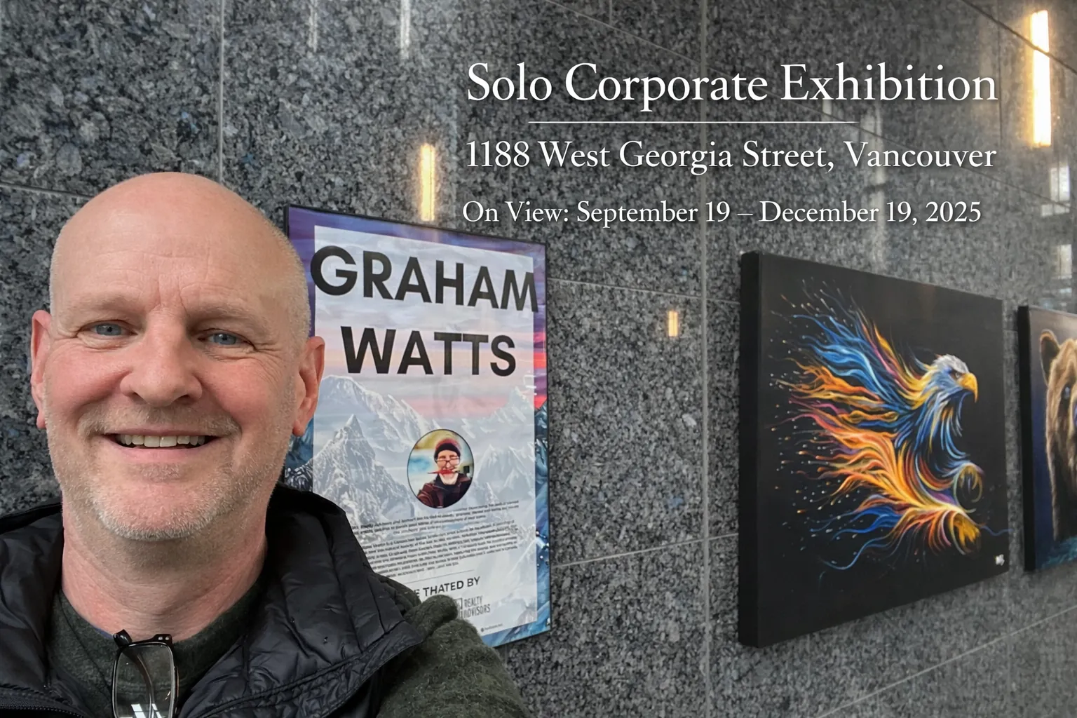
art exhibition Vancouver, Graham Watts, Canadian Artist, solo Exhibition, Corporate art

Vancouver Solo Corporate Art Exhibition 2025

This solo corporate exhibition features original oil paintings and fine art prints by Graham Watts, inspired by the Sea-to-Sky corridor and the wild coast of British Columbia. The collection is designed for high-impact display in professional spaces—boardrooms, lobbies, private offices, and client-facing environments.

Interactive Canadian Art Buyer Checklist

The Canadian Art Buyer Checklist is a simple, installable mini-app that guides you through purchasing art with confidence. Use it to tick off key steps—budget, authenticity, condition, shipping—while your progress saves automatically (even offline). Add it to your home screen, explore curated links to Canadian galleries and marketplaces, and email or export your completed checklist in one tap.

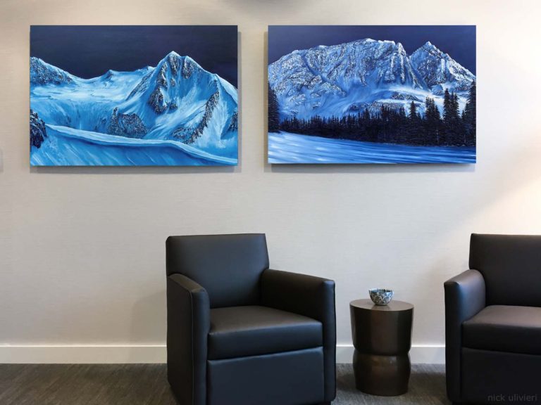
canadian art, two mountain landscape paintings by artist Graham Watts. buy fine art prints online

Canadian Artwork Tax Deduction

When it comes to decorating your office space, you may think of it as a mere aesthetic choice, but did you know that buying Canadian art for your office can also offer financial benefits through tax deductions?

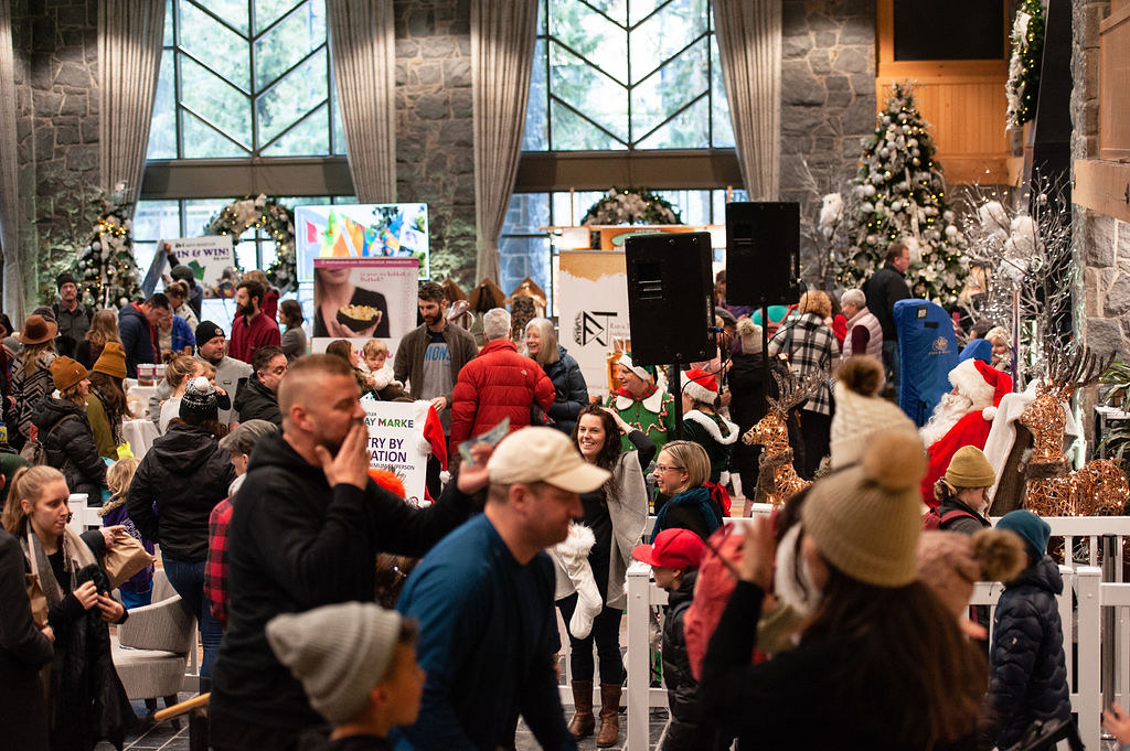
HOLIDAY MARKET, Westin Hotel, Whistler Events, November 29, 2025, ARTS WHISTLER,

ARTS WHISTLER HOLIDAY MARKET 2024

We are excited to announce that Graham Watts will be showcasing his latest collection of vibrant oil paintings at the “Arts Whistler Holiday Market 2024”! This annual event is a festive highlight in Whistler, bringing together a diverse array of artisans, crafters, and artists from across British Columbia. Discover Nature-Inspired Art Immerse yourself in the awe-inspiring beauty of British Columbia’s mountains, forests, and wildlife through Graham’s evocative artworks. Drawing inspiration from the breathtaking landscapes of Vancouver, Whistler, and the Sea-to-Sky Corridor, each painting serves as a bridge between nature and human emotion. Event Details Date: Saturday, November 31 and Sunday, December 01 Time: 10 am – 5 pm Location: The Westin Resort & Spa Whistler (4090 Whistler Way, Whistler, BC) Admission: Open to the public What to Expect at Graham’s Booth – Original Paintings: Explore one-of-a-kind masterpieces that capture the serenity and majesty of nature. – Limited Edition Art Prints: Available in various sizes and styles, professionally printed and perfect for gifting. – Commission Opportunities: Discuss the possibility of commissioning a personalized piece tailored to your taste. Why Attend the Arts Whistler Holiday Market? – Support Local Artists: Engage with creators and contribute to the vibrant Canadian art scene. – Unique Holiday Gifts: Find special items that inspire, offer an escape, and ignite conversations. – Festive Atmosphere: Enjoy live entertainment, delicious food, and the joyous spirit of the holiday season.

Canadian art for sale

Canadian Art for Sale

This guide helps you buy Canadian art you’ll love, covering originals, limited editions, and giclée prints. Learn where to shop, how to choose the right piece, check authenticity, set a budget, and care for your art. Includes popular styles like landscapes, wildlife, cityscapes, and Indigenous works, plus buying tips for online and offline sources.

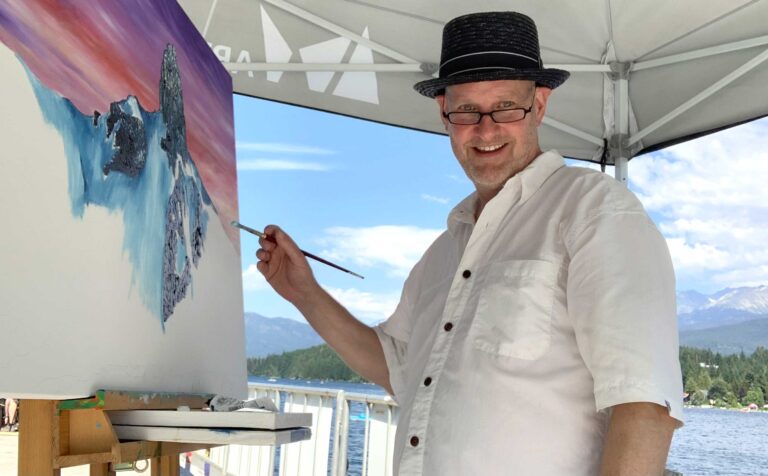
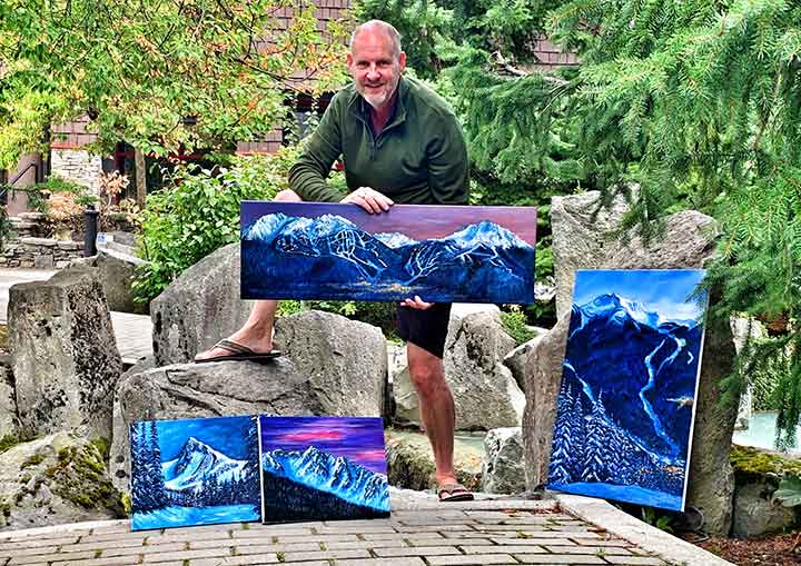
Canadian artist Graham Watts presenting Whistler mountain paintings outdoors in British Columbia

Buy Local Art in Vancouver BC Canada for Tourists.

Vancouver, BC's dynamic arts scene, showcasing the talents from local artists. Tourists, seize the chance to own a piece of the city's essence by investing in captivating local art.

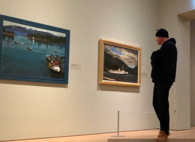
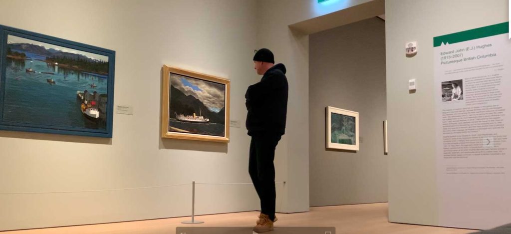
Canadian artist Graham Watts exploring iconic Canadian artwork of famous british columbia artists. E.J. Hughes collection of oil painting on the wall at the Audain Art Museum in Whistler BC.

Graham Watts’ Art: A Tribute to the Inspirations of E.J. Hughes, Lawren Harris, and Emily Carr

As an artist, Graham Watts is deeply inspired by the natural beauty of British Columbia and its surrounding areas. His paintings capture the essence of the Canadian wilderness, with a focus on the Sea to Sky, Whistler and Vancouver regions. His art is characterized by his use of vibrant colors and dynamic compositions, which are sure to capture your attention.

Canadian Artist Graham Watts: A Tribute to the Inspirations of E.J. Hughes, Lawren Harris, and Emily Carr

Canadian artist Graham Watts exploring iconic Canadian artwork of famous british columbia artists. E.J. Hughes collection of oil painting on the wall at the Audain Art Museum in Whistler BC.
Visiting the E. J. Hughes exhibit. Audain Art Museum - Whistler, British Columbia, Canada

Graham Watts: Capturing the Essence of British Columbia's Natural Beauty

As an artist deeply rooted in the breathtaking landscapes of British Columbia, Graham Watts draws inspiration from the rich tapestry of the Canadian wilderness and the vibrant urban life of Vancouver. His artworks, characterized by vibrant colors and dynamic compositions, serve as a testament to his profound connection with nature and the artistic influences that shape his creative vision.

Inspiration from the Canadian Wilderness

A Love Affair with the Sea to Sky, Whistler, and Vancouver

Graham Watts finds his muse in the natural beauty of British Columbia, particularly in the Sea to Sky, Whistler, and Vancouver regions. His paintings are a visual journey through these landscapes, capturing the essence of the Canadian wilderness. Vibrant colours and dynamic compositions define his work, creating pieces that are not only visually striking but also emotionally evocative.

E.J. Hughes: A Powerful Influence

Drawing Parallels with Coastal Scenes

One artist who profoundly influences Graham is E.J. (Edward John) Hughes, renowned for his powerful coastal scenes. Hughes’s depiction of British Columbia resonates with Graham, drawing parallels in the raw strength of nature and the emotional impact their works convey. The rugged coastline, wild skies, and the raw power of the sea depicted in Hughes’s paintings find echoes in Graham’s art. The bold and expressive style, especially in the use of colour and composition, is a shared thread between the two artists.

Group of Seven: A Collective Inspiration

Echoes of Emily Carr and Lawren Harris

Graham Watts also finds inspiration in the legacy of the Group of Seven, a collective of Canadian painters active in the 1920s and 1930s. Influential figures like Emily Carr and Lawren Harris, celebrated for their depictions of the Canadian wilderness, leave an indelible mark on Graham’s artistic expression. Harris’s serene and spiritual portrayal of the landscape resonates in Graham’s work, creating paintings that are not merely landscapes but also meditative reflections of nature’s beauty.

Endless Inspirations from Nature

A Celebration of the Canadian Wilderness

The natural environment is an infinite source of inspiration for Graham Watts. His art is a celebration of the Canadian wilderness, capturing the endless beauty, rugged landscapes, and wildlife that define the region. Each stroke of his brush pays homage to the wonders of nature, creating artworks that invite viewers into a realm of beauty and contemplation.

Cityscape Inspirations: Vancouver's Serenity

Appreciating Vancouver’s Urban Beauty

While deeply connected to the wilderness, Graham Watts’s art also reflects the urban allure of Vancouver. His appreciation for the city’s skyline and the reflections of buildings on the water surface in his paintings creates a unique blend of natural and urban beauty. The cityscape, portrayed with beauty and serenity, adds another layer of depth to Graham’s diverse body of work.